The homepage of the Orlando Sentinel website on January 20, 2013.
I was assigned to cover the Orlando Sentinel for #loweclass. After reviewing the website I found that it covered a lot of different news categories. There were tabs for all the different sections, like a normal news website would have. The website has many different components to it as well.
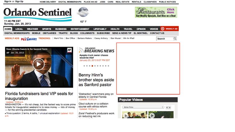
The overall design of the website is pretty plain and simple. The website has very little color except for the pictures and videos. There are 11 tabs at the top of the homepage which cover: entertainment, business, sports, weather, local, life/family, health, travel, opinion, and videos. Each of the tabs have subtabs below them which give more topics about that specific category. This makes the information very easy to use. If you have a general idea of what you are searching for, the tabs and subtabs really help. There is also a search bar if you are looking for something very specific as well. The main story on the homepage contains a picture or video that fills up about a third of the page.
There is a lot of use of technology throughout the website. There are two different categories of
videos along the side of the homepage. There are popular videos and top videos. There is also a little tab right next to the top story that involves breaking news. The tab has the headlines of the breaking news stories. Overall the technology on the website seems pretty basic, and there is nothing spectacular about it.
The actual content of the website seems like most news websites. The categories are basically the same and the Orlando Sentinel also offers news from all over. It contains local news coverage as well as national and world news. At the very bottom of the homepage, there is a section called El Sentinel, which contains stories in Spanish. I believe that the Orlando Sentinel gives all the necessary components of a news website, but just in a very basic way. There is no wow factor to it. Besides all the basic elements, there are many ads on the website as well. There are ads along the
side of the website underneath the videos. There are ads on most websites, but I just find them distracting and annoying.
Overall the site seems very easy to use, but very basic as well. I am excited to cover the Orlando Sentinel, but was just hoping there would be more pizzazz and color to it.
 RSS Feed