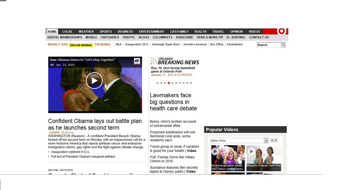
The coverage of the Presidential Inauguration on the homepage of the Orlando Sentinel.
The Orlando Sentinel did a decent job of covering the inauguration yesterday. Most of the coverage however was not done by the Orlando Sentinel. They used videos and photos from other news sources like the Associated Press and the Chicago Tribune. I will give them credit for having the inauguration be their main story throughout the day, while other news websites did not.
The main story on the homepage was a video of Obama's speech and then a two-page story that accompanied it. The story covered Obama taking his oath, some reactions from the crowd, and what the future holds for the President. Since the inauguration did take place on Martin Luther King Jr. Day, I thought there would be an article that focused on the connection between the two leaders. In the two-page story, MLK Day was briefly mentioned when Obama took his oath. Obama had his hand on two bibles; one from President Abraham Lincoln and the other from Martin Luther King Jr.
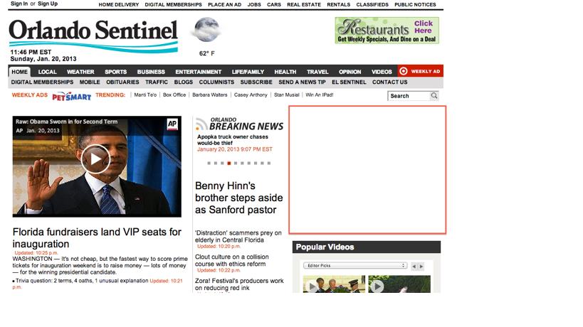
The Orlando Sentinel also had tabs on the top of the homepage which consisted of a MLK tab and an Inauguration 2013 tab. The MLK page consisted of a photo gallery of about eight pictures. The pictures were of Martin Luther King Jr and his family and friends. I did assume that there would
be a story to go along with the pictures, but there was not.
The Orlando Sentinel did post video coverage from other news sources. They had the performances of Beyonce, Katy Perry, and Kelly Clarkson covered. They did post a really nice video, which was taken from the Chicago Tribune, of the whole inauguration summed up into a one minute video. It included the set-up of the day till the take down of the event. Also there was a photo gallery which had pictures from throughout the day as well as pictures from some of the inauguration balls. The Sentinel also had Obama's speech typed out word for word, which was nice to be able to read.
Overall the Orlando Sentinel had good coverage of the event, but not a lot was original coverage. I also did not really like the layout of the coverage. It seemed to be all over the website instead of one specific area.
The main story on the homepage was a video of Obama's speech and then a two-page story that accompanied it. The story covered Obama taking his oath, some reactions from the crowd, and what the future holds for the President. Since the inauguration did take place on Martin Luther King Jr. Day, I thought there would be an article that focused on the connection between the two leaders. In the two-page story, MLK Day was briefly mentioned when Obama took his oath. Obama had his hand on two bibles; one from President Abraham Lincoln and the other from Martin Luther King Jr.
The Orlando Sentinel also had tabs on the top of the homepage which consisted of a MLK tab and an Inauguration 2013 tab. The MLK page consisted of a photo gallery of about eight pictures. The pictures were of Martin Luther King Jr and his family and friends. I did assume that there would
be a story to go along with the pictures, but there was not.
The Orlando Sentinel did post video coverage from other news sources. They had the performances of Beyonce, Katy Perry, and Kelly Clarkson covered. They did post a really nice video, which was taken from the Chicago Tribune, of the whole inauguration summed up into a one minute video. It included the set-up of the day till the take down of the event. Also there was a photo gallery which had pictures from throughout the day as well as pictures from some of the inauguration balls. The Sentinel also had Obama's speech typed out word for word, which was nice to be able to read.
Overall the Orlando Sentinel had good coverage of the event, but not a lot was original coverage. I also did not really like the layout of the coverage. It seemed to be all over the website instead of one specific area.
 RSS Feed